Ever picked up a product because its packaging felt like a time capsule? You’re not alone. From classic biscuit tins to nostalgic soda bottles, vintage packaging taps into the powerful pull of memory. It’s not just about aesthetics—it’s about storytelling, trust, and evoking a sense of timeless quality. Today, brands both old and new are turning to vintage styles to make their products stand out in a saturated marketplace.
In this article, we explore the iconic elements that make vintage packaging so beloved—from typography and colours to materials and textures. Whether you’re a business owner, designer, or just someone who appreciates retro vibes, this guide will help you understand the enduring appeal of the past—and how you can apply it today.
Key Takeaways
- Vintage packaging uses nostalgic fonts, retro colour palettes, and classic packaging materials to create a sense of authenticity.
- The psychology behind retro packaging design helps brands form emotional bonds with consumers.
- Many companies use vintage aesthetics to establish timeless branding that resonates in a modern market.
- Successful packaging balances style and functionality to meet today’s needs while preserving nostalgic charm.
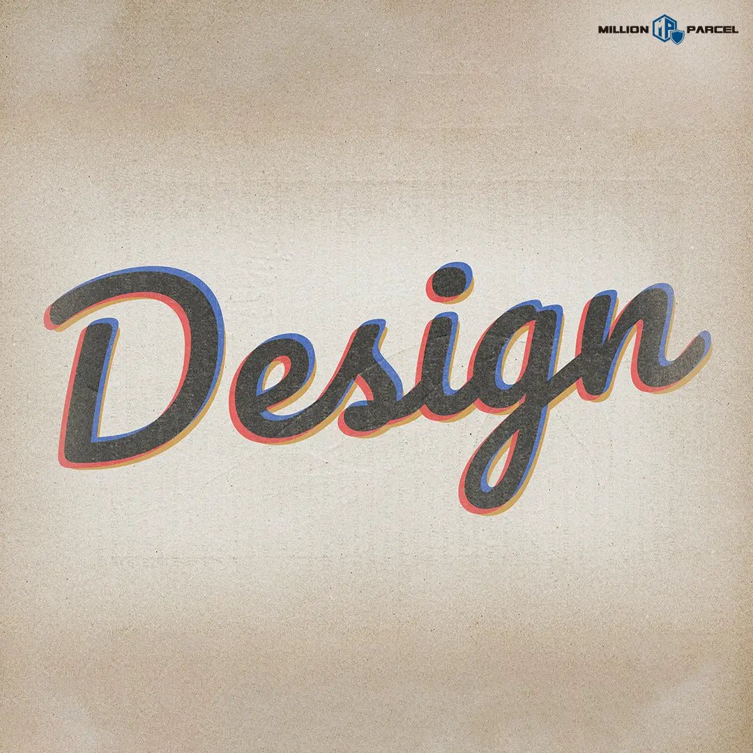
What Makes Packaging Design Look Vintage?
What Are the Most Iconic Vintage Typography Styles?
Typography is the beating heart of vintage packaging. From ornate scripts to bold sans-serifs, fonts tell a story long before a customer even opens a product.
One hallmark of retro packaging design is the use of serif fonts, often with decorative curls and contrast between thick and thin strokes. These fonts exude elegance and formality, echoing the early days of advertising. Meanwhile, mid-century packaging favoured bold block lettering—the kind you might see on a 1950s toothpaste box or a diner sign.

Equally powerful is the charm of hand-drawn types. In the digital age, imperfect letters feel warm and human. That’s why many brands use hand-lettered logos on vintage packaging to signal authenticity and craftsmanship.
Typography doesn’t just add visual interest—it builds emotional connection. Serif fonts suggest heritage and trust, while script fonts feel personal. Together, they help brands craft timeless branding that sticks in consumers' minds.
What Colour Palettes Define Retro Packaging Design?
Colour is just as important as font in crafting the look and feel of vintage packaging. Unlike today’s sleek and minimal designs, retro packaging design often uses warm, desaturated hues that hint at age and familiarity.
Think sepia tones, mustard yellows, pastel pinks, and dusty blues—shades you’d find on an old cereal box or soda label. Each era had its signature palette. The 1920s favoured bold golds and blacks for glamour, while the 1970s went earthy with oranges, olives, and browns.
These colour choices evoke specific emotional responses. Warm tones feel nostalgic and comforting. Pastels feel playful. When used well, a retro colour palette sets a product apart from sterile modern packaging and creates a deeper connection.
It’s this contrast that makes retro materials shine. In a retail world dominated by minimalism, richly coloured and intricately detailed designs grab attention—and hold it.
What Materials and Textures Make Vintage Packaging Feel Authentic?
Materials play a huge role in the authenticity of vintage packaging. Back before plastic became the norm, packaging was an experience in itself.
Common classic packaging materials include:
-
Kraft paper: Offers a raw, rustic look
- Tin cans: Often used for food and household items
- Glass bottles: Once standard for sodas and cosmetics
- Embossed labels and foil stamping: Add texture and elegance
These materials weren’t just functional—they were tactile and often reusable. Unlike the disposability of plastic packaging, older materials were built to last, and that longevity carries an emotional weight.
Modern brands tapping into vintage packaging trends often use textured finishes—matte, linen, or foil-stamped elements—to elevate the sensory feel. When a package feels luxurious, it enhances the perceived value of what’s inside.
How Brands Use Vintage Packaging to Stand Out
Why Are More Brands Bringing Back Retro Packaging?
Nostalgia is a powerful motivator. Studies show that nostalgic branding increases consumer trust and purchase intent. That’s why many brands are embracing vintage packaging—it makes people feel something.
Whether it’s a limited-edition throwback label or an entire product line styled after the 1950s, retro packaging design brings warmth and familiarity. A biscuit tin like Grandma used to have. A cola bottle with its original 1920s look. These visuals don’t just remind people of the past—they create emotional ties that drive sales.

In Singapore, where multicultural heritage runs deep, this kind of timeless branding resonates even more. Local brands have started exploring vintage packaging to stand out in a sea of trendy, minimalist products. It’s not just about looking different—it’s about creating lasting impressions.
Brands Successfully Reviving Vintage Packaging
Some of the world’s biggest companies are leaning into retro-styled wrapping to spark consumer interest:
Coca-Cola frequently reissues classic bottle designs and vintage ads to reinforce its legacy.
Hershey’s has used old-style wrappers during anniversaries to invoke nostalgia.
Campbell’s Soup leveraged Andy Warhol’s pop art to celebrate its heritage.
Even newer brands are using retro packaging design to stand out. Craft breweries, artisanal food brands, and skincare lines are embracing vintage styles to communicate authenticity and quality.
In Singapore’s competitive retail space, incorporating vintage packaging into your product strategy can offer a meaningful point of difference. Whether you’re selling candles, chocolate, or even carton boxes, going vintage can help your brand leave a mark.
How Can You Design a Vintage-Inspired Boxing for Your Brand?
So how do you design your own vintage packaging? It starts with understanding your audience and product—and then layering nostalgic elements with practical usability.
Typography tips:
- Use serif or script fonts with historical flair
- Avoid overly clean, geometric fonts that scream digital
Colour strategy:
- Choose retro hues—pastels, sepias, mustard, and navy
- Ensure contrast and readability while maintaining that faded charm
Material choices:
- Consider using classic packaging materials like kraft paper or embossed card
- If sustainability is key, choose recycled or biodegradable alternatives that still give a vintage feel
Balance practicality and style:
- Add resealable closures or clear windows for usability
- For food products, make sure your food packaging options comply with hygiene and durability standards
MillionParcel provides custom solutions to bring these ideas to life—whether you're designing plastic packaging, printed kraft wrappers, or retro-themed carton boxes.
Frequently Asked Questions
Why does vintage packaging feel more premium than modern designs?
The use of richer materials, handcrafted typefaces, and textured finishes contributes to the sense of luxury. Old-school wrapping styles feel more intentional and thoughtful—less mass-produced, more meaningful.
Is vintage packaging just a trend or a long-term strategy?
While certain design styles trend in cycles, this type of packing taps into something deeper—human emotion. Brands that use it effectively build timeless branding that doesn’t rely on fleeting fads.
How can I make my brand’s packaging feel vintage but still modern?
Start with retro packaging design principles—typography, colour, and material—but update them with modern features. For example, use eco-friendly plastic packaging or introduce QR codes for interactivity.
Vintage packaging isn’t just a blast from the past—it’s a powerful branding tool. With the right blend of nostalgia and innovation, it creates emotional connections, evokes trust, and stands out on crowded shelves.
From classic packaging materials like kraft and glass to retro fonts and colour schemes, every detail plays a role in telling your brand’s story. When done right, vintage packaging becomes more than just a wrapper—it becomes part of the product experience.
If you’re looking to create packaging that combines style, sustainability, and charm, MillionParcel has the tools and expertise you need. Whether it’s a nostalgic food wrap or a stylish carton box, we help brands bring their vintage packaging dreams to life—one design at a time.
Tinggalkan komen
Laman ini dilindungi oleh hCaptcha dan tertakluk pada Dasar Privasi dan Terma Perkhidmatan hCaptcha.